
Or: How the Simplest App Turned Into the Most Difficult Thing We’ve Ever Built
Chapter 1: It’s Never Too Late (to Get in Trouble)
I was nearly 50, with a fulfilling career in media production behind me, and a notebook full of ideas I’d never acted on. One of those ideas was a stock trading video game, but I needed something smaller to kick things off. Something simple. Something we couldn’t possibly mess up.
Famous last words.
A Problem So Stupid, It Had to Be Solved
It started with a drive. Same route, same days, same hour: crossing town to meet my business partner, Nicolas. Open Google Maps. Type his name. Nothing.
Weird.
Try Apple Maps. Still nothing.
I had him in my contacts. I’d marked his place as a favourite. I’d driven there dozens of times. And yet, both apps behaved like they’d never heard of the place before.
Turns out both apps treat favourites like labelled coordinates. Not people. If you don’t label things exactly right, you can’t search for them. But wait, on the favourites screen, there’s not even a search bar.
That’s when I realized: we need an address book. For maps. Not one buried inside a contact app, but one designed for this very purpose.
And just like that, Maps Address Book was born.
The App Store’s Missing Utility
When I asked around, it turned out everyone had the same problem. People were screenshotting addresses, texting themselves notes, or memorizing street names just to get directions to familiar places.
We checked the App Store: nothing like what we had in mind. Even the name was available. We couldn’t believe it.
The premise was dead simple:
- Save places by name
- Search them instantly
- Tap to launch directions
We weren’t reinventing the wheel. We were fixing a flat.
Design First, Panic Later
I started sketching mockups on my Supernote. Clean UI. Big buttons. Fat fingers welcome. I added sorting, a call button, maybe a slide-to-call. Suddenly, the “simple” app wasn’t so simple anymore.
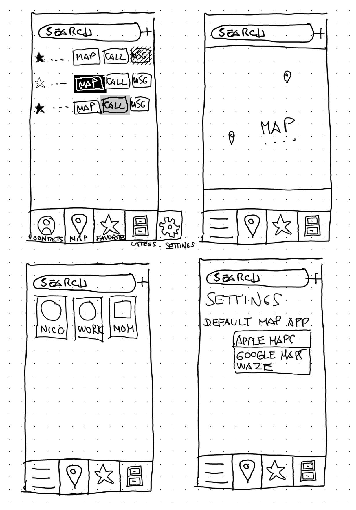
So we cut back. Version 1 had to be barebones. Just addresses, notes, and a clean list. We’d listen to feedback and grow from there.
What could possibly go wrong?
Chapter 2: Oh Right, Everything
The Swift 6 Surprise
When Nicolas began development in Xcode, he aimed for modern Swift. But modern Swift had other plans.
📍 The Problem: Swift 6’s Sendable Protocol
With iOS 18 and Swift 6, Apple introduced strict compile-time enforcement of the Sendable protocol to ensure thread safety. Sounds great on paper—until your entire object graph breaks because ReferenceWritableKeyPath no longer conforms.
Any type used in SwiftData queries had to be made Sendable. That meant cascading refactors across every related model—addresses, GPS coordinates, contact metadata, you name it.
What used to be a one-line query became a migration saga. We spent days untangling property chains, wrapping unsafe types, and splitting logic just to satisfy the compiler.
The silver lining? Our app is now robustly thread-safe and future-proof. The process was painful, but the result is a rock-solid data layer.When Nicolas began development in Xcode, he aimed for modern Swift. But modern Swift had other plans.
When CloudKit Isn’t Kitten Around
Once we tackled Swift 6, it was time to implement sync across devices. Enter: CloudKit.
☁️ The Problem: Schema Hell and Relationship Doom
CloudKit promised seamless cross-device sync. What it actually gave us: optional fields everywhere, bidirectional relationships that could crash the app if mishandled, and no support for uniqueness constraints.
Migrating our existing SwiftData schema required redesigning how relationships, defaults, and object identity worked. Every attribute had to be nullable. Every inverse relationship had to be defined manually. Duplicate prevention became a hand-rolled logic problem.
And let’s not talk about testing sync state across devices and network conditions. Or the invisible bugs caused by conflicts between offline edits and online sync.
Was it worth the pain? Yes. But only because Nicolas’ nerves didn’t give out.
Classic Apple: 90% magic, 10% undocumented disaster.”
Chapter 3: The Details That Weren’t Optional
Icon Design: AKA Three Weeks of Existential Crisis
You’d think designing an icon would take a day. Try three weeks.
It needed to look beautiful on a full-screen App Store preview, and still make sense as a tiny square on a 4-inch phone. Most AI-generated icons looked amazing—until you shrank them. Then they turned into pixel mush.
So I grabbed my stylus and got old school. We needed:
- A map
- Some tabs or letters (for the address book)
- A book shape
One sketch later, we had it. A simple, clear icon that worked big and small.
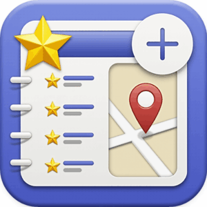
I fired up my trusty old Stable Diffusion workflow, entered “Maps Address Book app icon” and this is the very first image that came out:
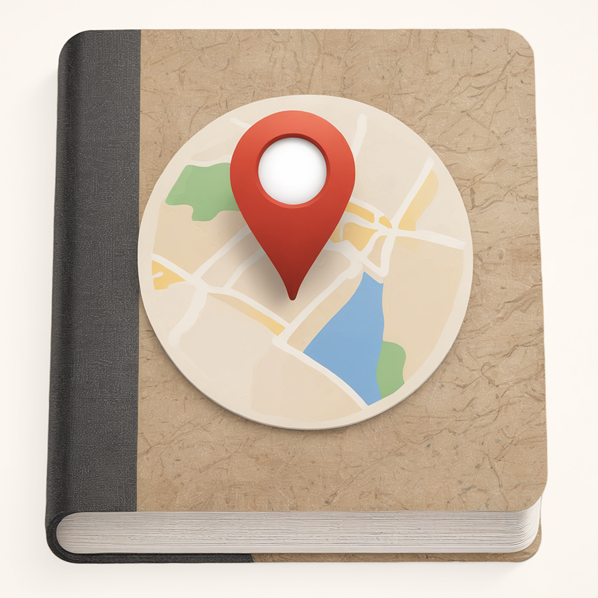
At the time, we thought… Oh wow, it’s perfect! Alas, even though it looked great at first sight, as soon as we displayed it at icon size on mobile we realized it didn’t fit at all: too small; low contrast; the map isn’t visible at all. So I went back to the drawing board, and tried my best to make something more punchy, vivid and… visible.
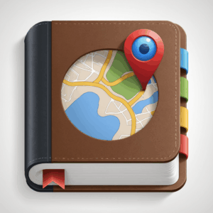
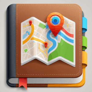
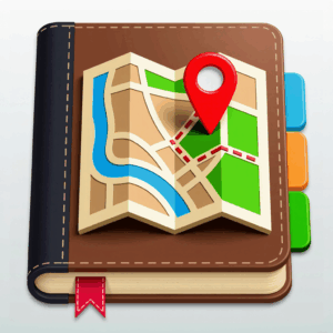

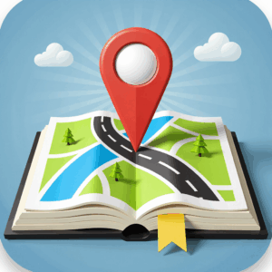
After a few hundred tries, I had a better concept. Full screen, it looked fantastic, but each time there was something wrong: cannot see the tabs; perspective is off; cover map not visible enough; too video-gamey; too Ai-looking; too average… So I took all the concepts I had found so far, and put them all together in a high-contrast, high visibility icon. And now we had it, the final version:
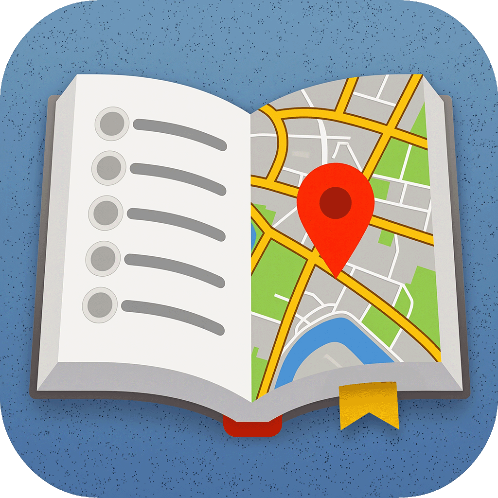
It took a lot of trials, on many different screens at different sizes, some compositing and a lot of frustration, but I eventually got it. Turns out, diffusers are cool, but they don’t understand anything about accessibility. At all.
Lesson: AI can help. But it doesn’t understand visual constraints. You still need a human eye.
Localization: The Hidden Boss Level
We knew we wanted Maps Address Book to reach beyond Canada. So we localized.
Turns out “localization” doesn’t mean just translating text. It means:
- Translating everything, including images and App Store pages
- Accounting for RTL layouts (hello Arabic)
- Fixing font bugs (Korean, we see you)
- Copy-pasting translated strings into Photoshop for each language, then exporting each image again
Even using Claude to generate context-aware translations wasn’t enough. Native speakers still needed to review everything. And the App Store requires screenshots in all major languages.
If you ever want to understand the soul of a language, try spacing translated UI text across 12 screenshot templates with right-aligned fonts. In Photoshop.
Chapter 4: What We Learned
We started this project thinking: “This will be easy. It’s just a simple utility.”
Here’s what we learned instead:
Listen early. User feedback saved us from building the wrong things. People didn’t want flashy features—they just wanted their damn addresses.
No project is simple when you care about quality.
Coding is 20% of the work. The other 80% is design, UX, marketing, support, internationalization, and testing.
The App Store matters. A great description, localizations, and polished screenshots are not optional.
Design for discoverability. A clear UI isn’t enough—people need to feel how to use it.
LLMs help. Claude helped with Swift syntax, architecture, and translations. But it couldn’t make decisions or resolve nuanced UX. AI is your copilot, not your captain. Vibe coding? What a joke. Blood and tears is what got us to the finish line.
Epilogue: So Was It Worth It?
Absolutely.
In one year of building Maps Address Book, I’ve learned more about psychology, global UX, and product strategy than in 20 years of media production.
It wasn’t the app we thought we’d build. But it was the app we (and apparently a whole bunch of other people) needed.
And next time someone tells you “I wanna make an app.” hand them this article.
Then pour them a drink.